





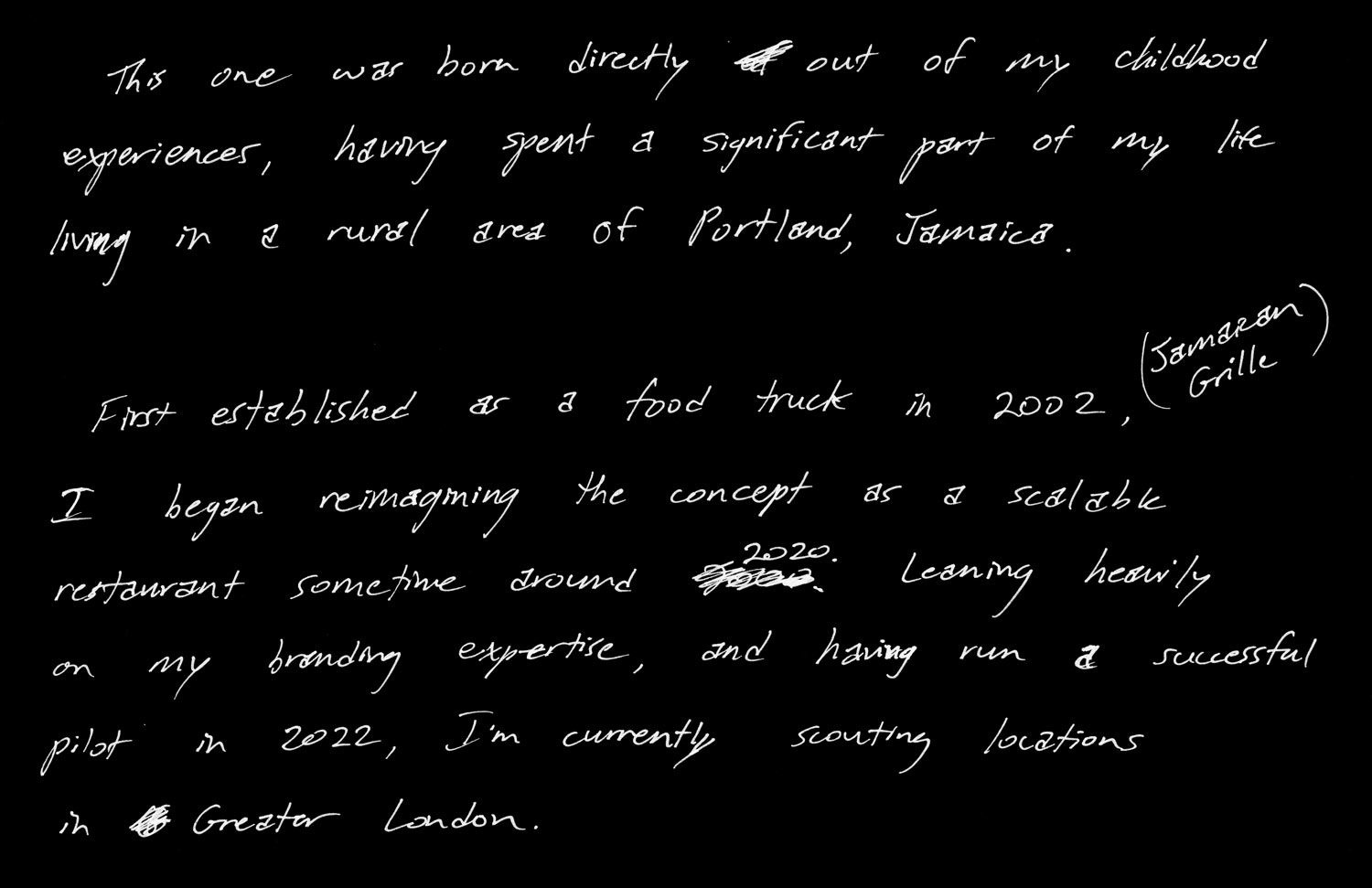
This one was born directly out of my childhood experiences, having spent a significant part of my life living in a rural area of Portland, Jamaica.
First established as a food truck in 2002 (Jamaican Grille), I began reimagining the concept as a scalable restaurant sometime around 2020. Leaning heavily on my branding expertise, and having run a successful pilot in 2022, I’m currently scouting locations in Greater London.
The mission — Develop branding and interior design for a scalable Jamaican restaurant.
Origin Story
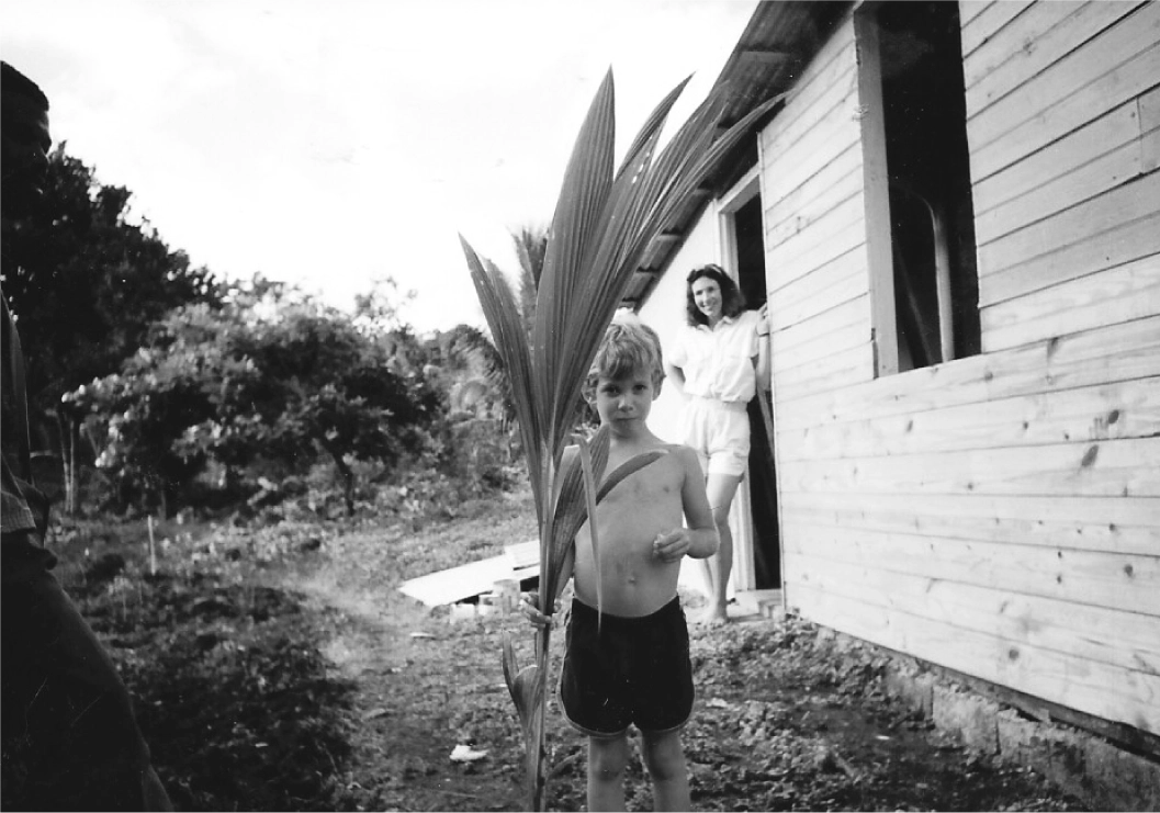
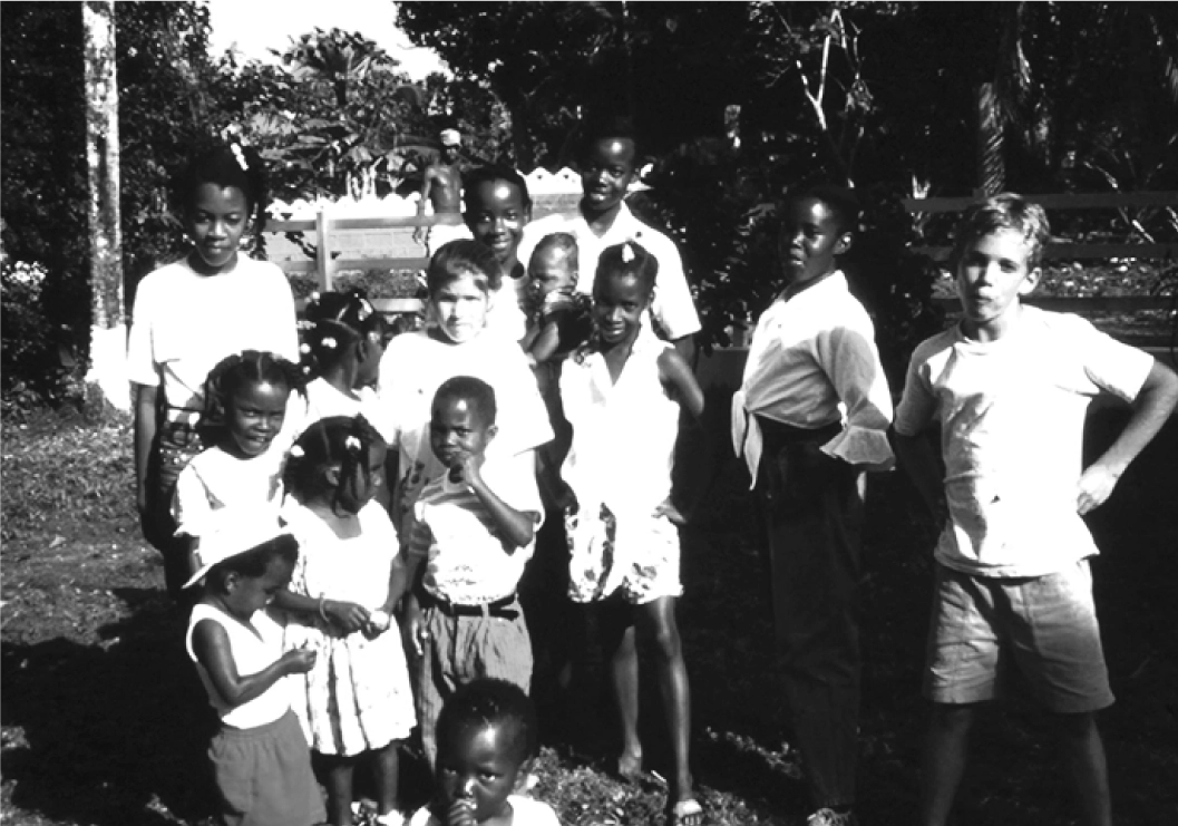
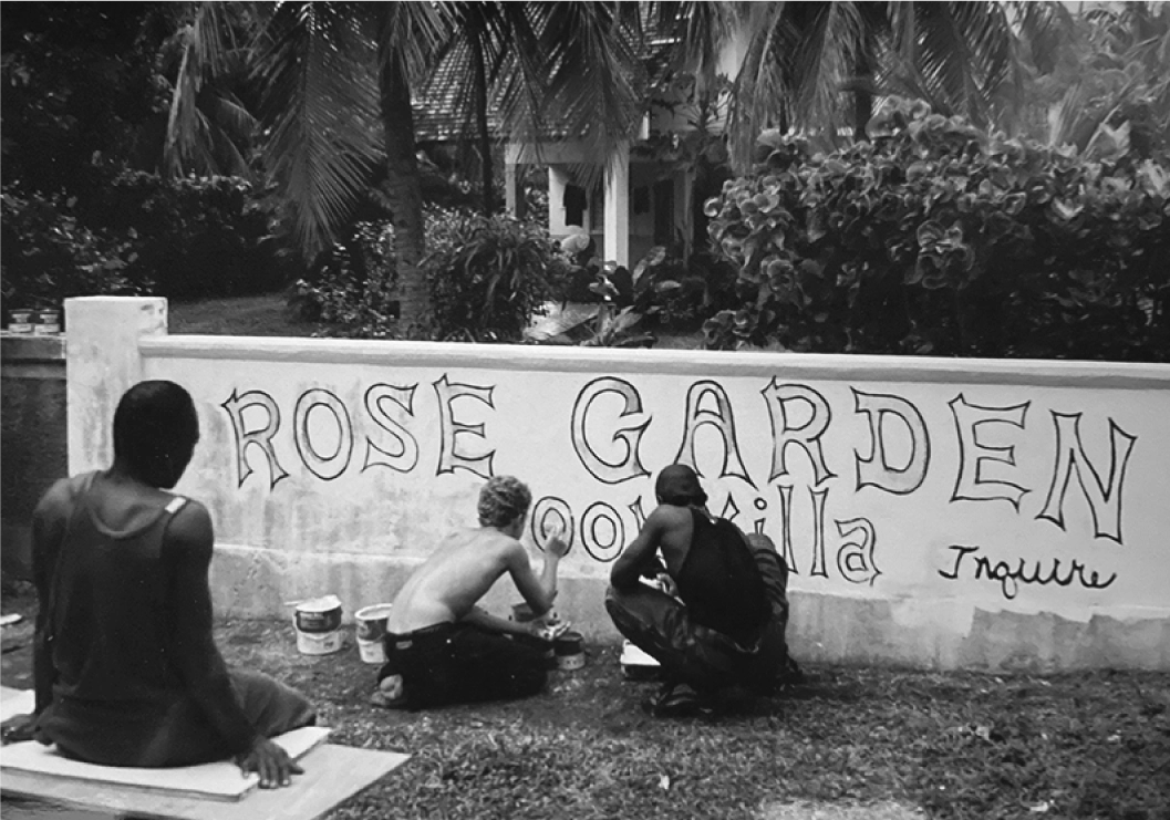
I split my childhood between Maine and Rose Garden, a small community in rural Portland, Jamaica. Those winters taught me to garden, spearfish, and cook over an open fire using ingredients sourced from the land.
RumHoney comes out of that time and that place — from an appreciation of the food, the people, the culture.
The Visual Identity
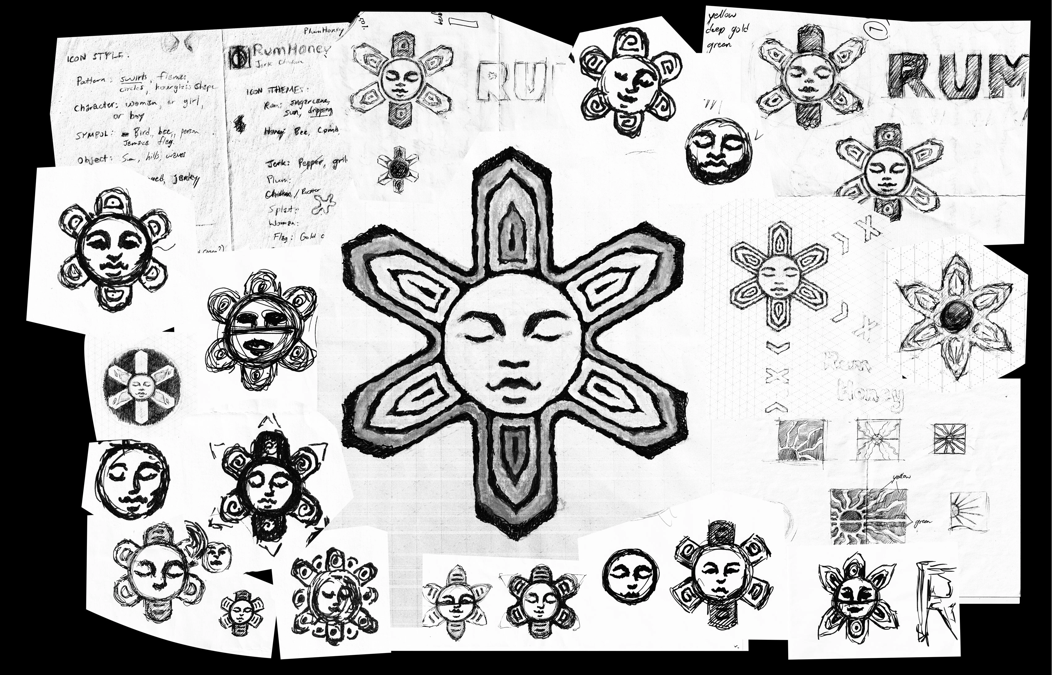
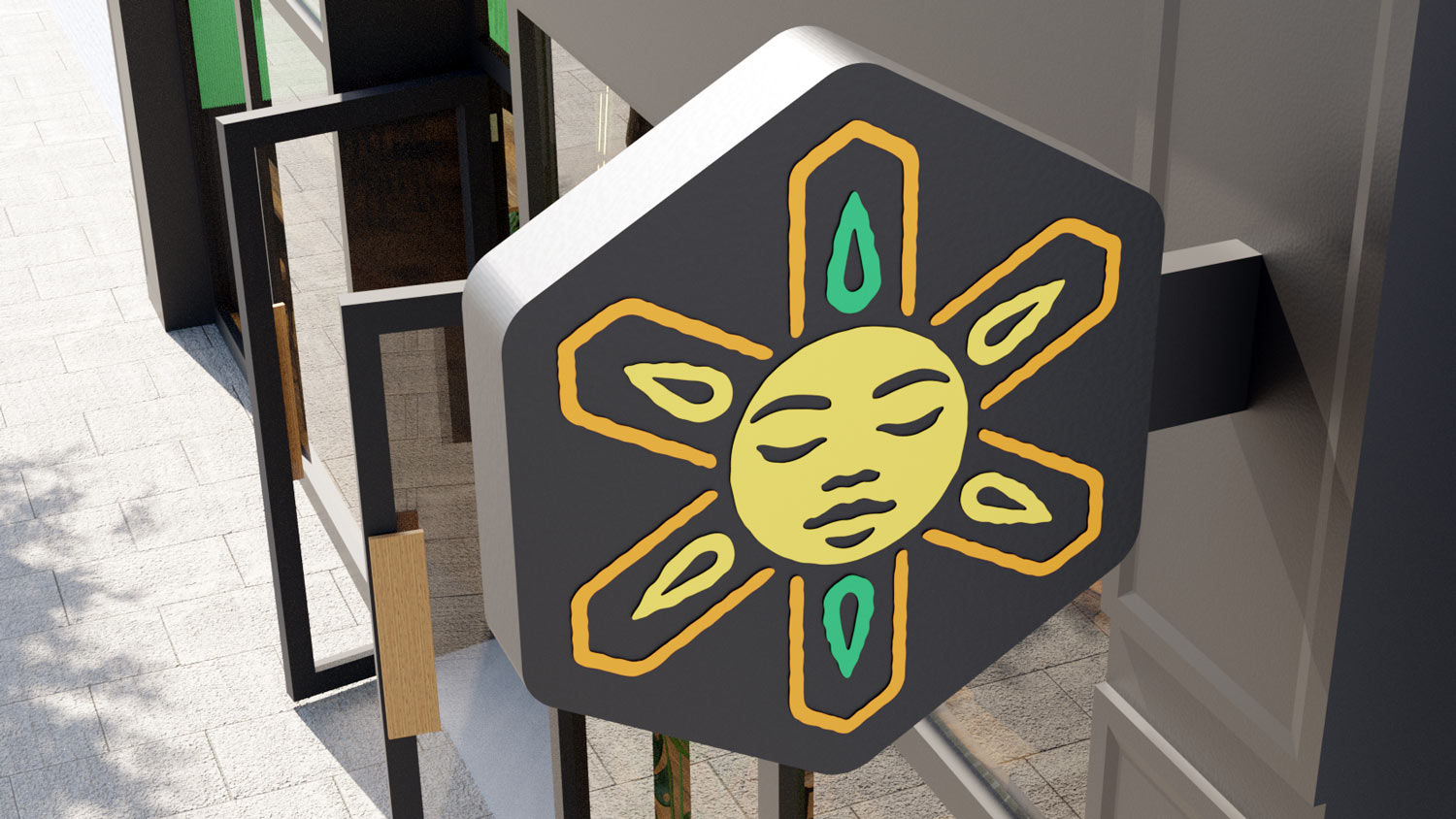
The goal was to create a symbol that felt meaningful and connected directly to the people of Jamaica, while avoiding the common stereotypes so often portrayed by media and advertising. For the palette, yellow, green, and red are the obvious choice, but felt too close to a Rastafarian cliché. An orange-gold became the substitute for red, evoking fire, rum, and warm honey.


early inhabitants of Jamaica

Expanding the Identity
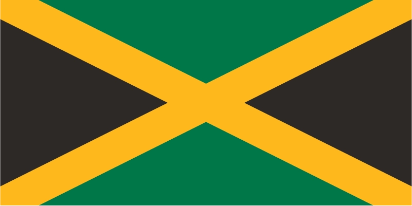
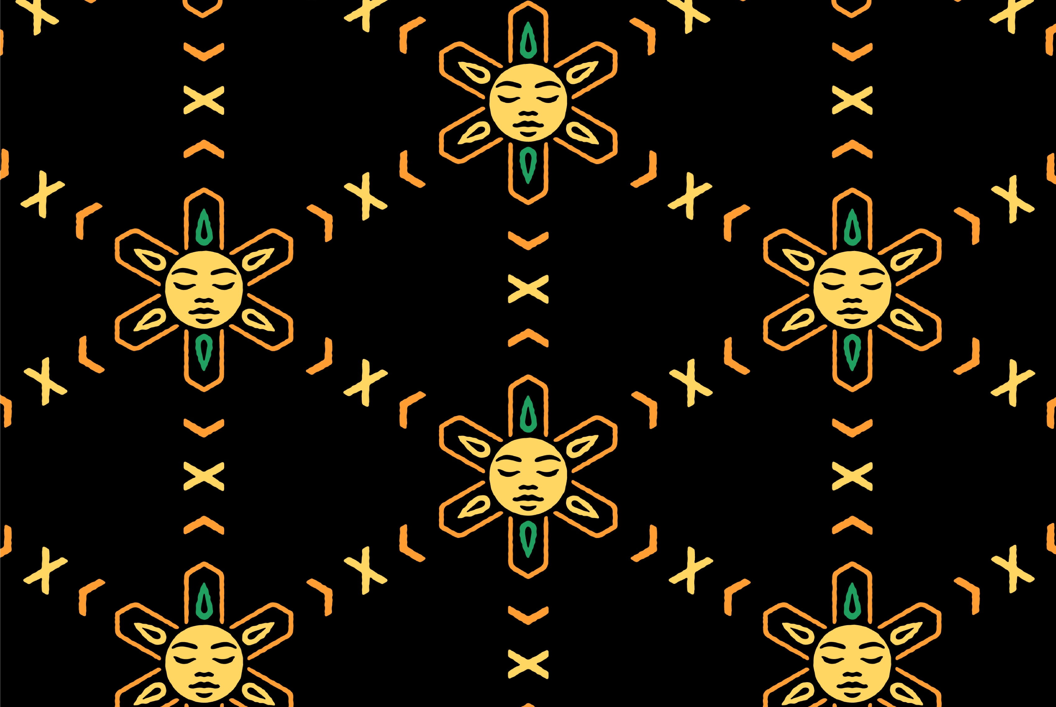
The RumHoney emblem lent itself naturally to a repeatable pattern. This can be used as a distinctive motif on walls, packaging, and other branded materials. The pattern grows outward from the points of each icon. Where the extending shapes from neighbouring icons meet, they cross to form the saltire of the Jamaican flag. The end result is an overlapping honeycomb, linking back to the brand name.
The Physical Space
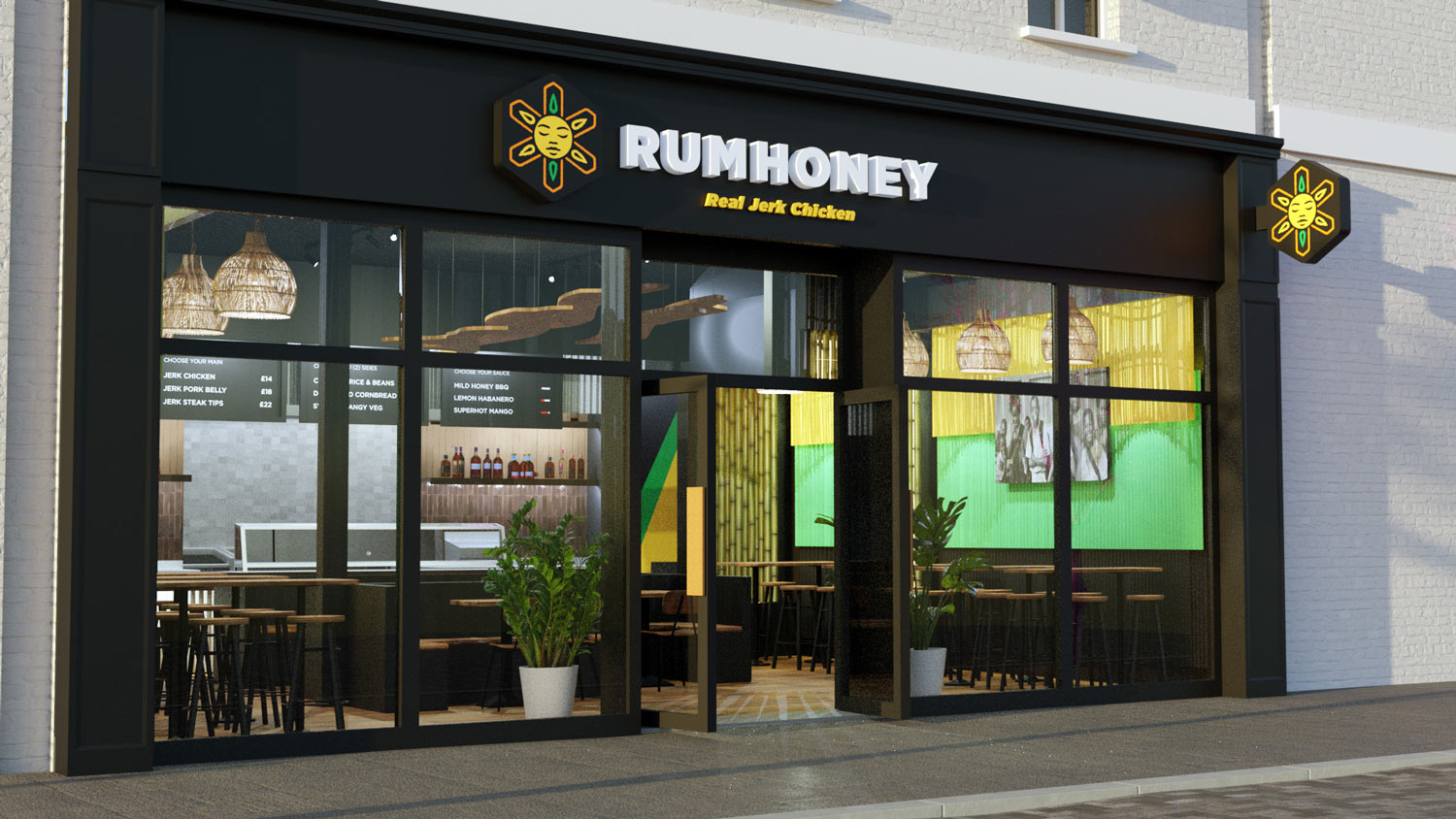
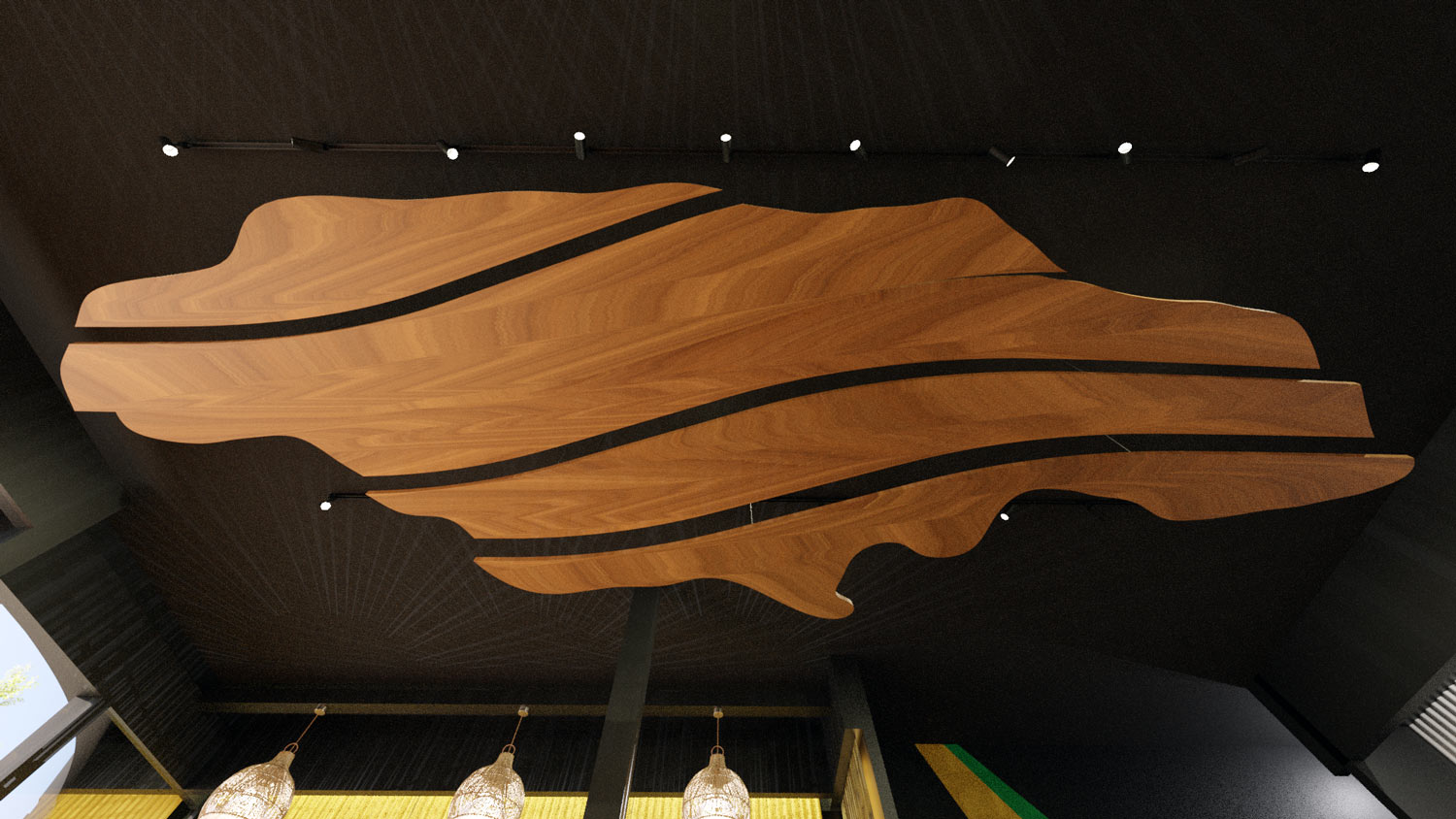
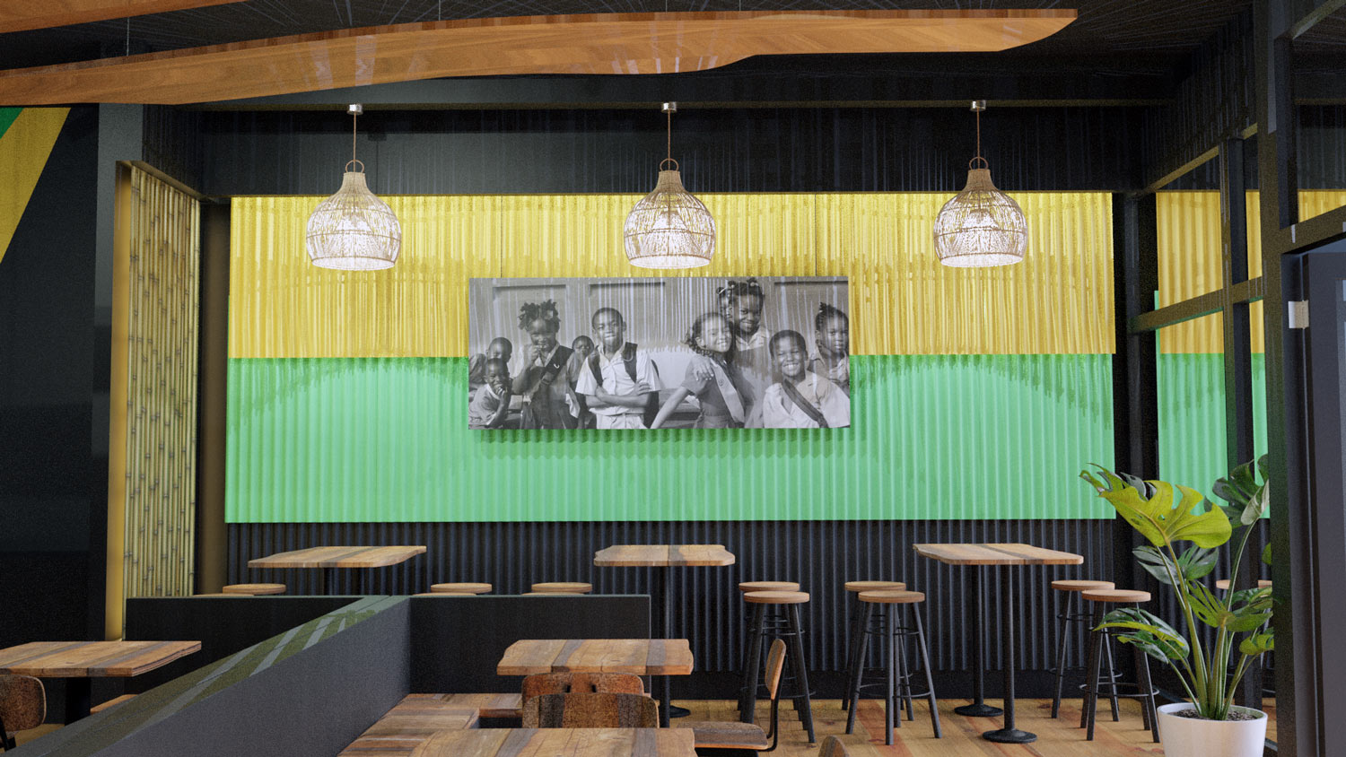
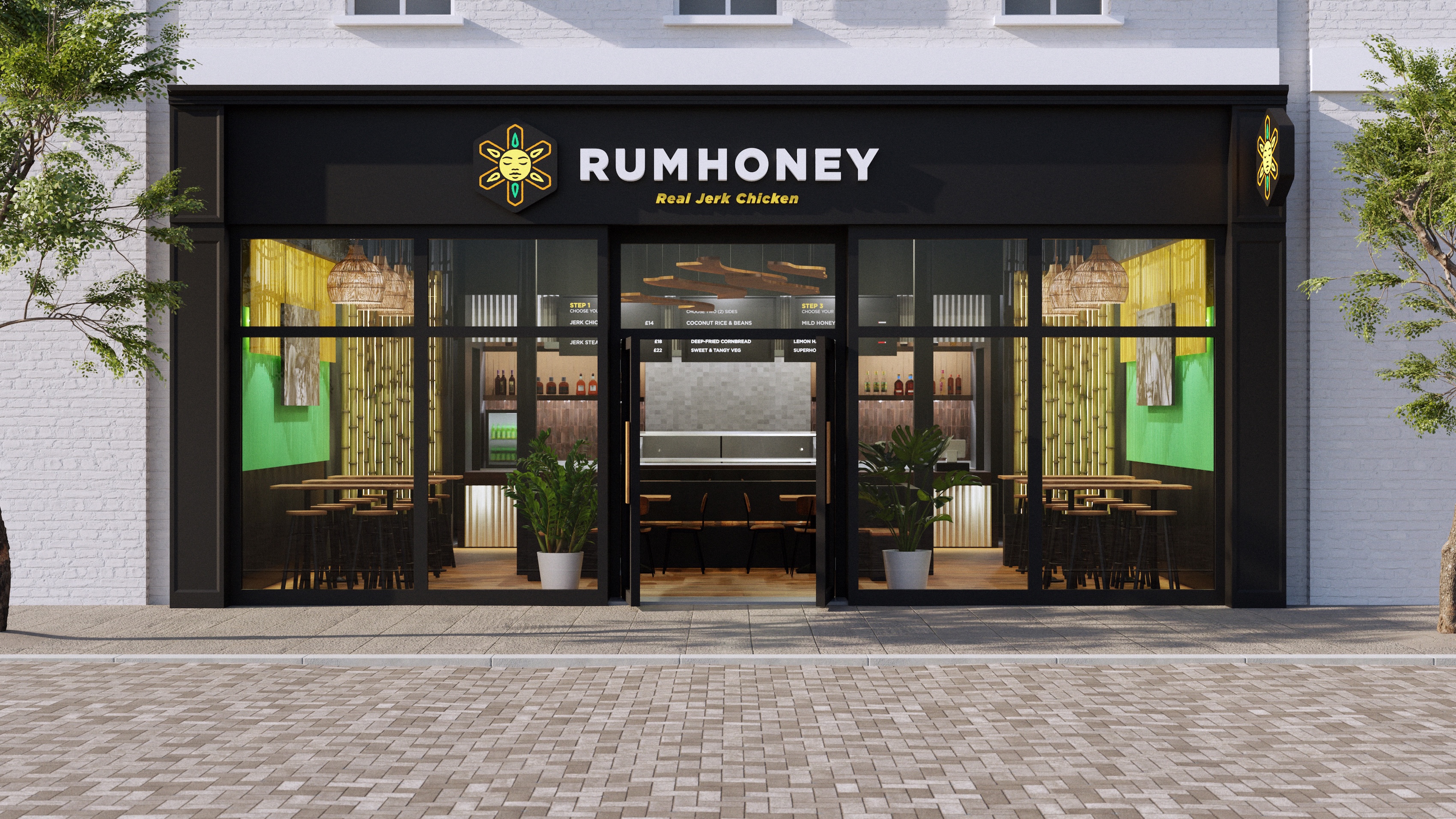
The goal for the physical space was to build from authentic materials, drawing from the island directly rather than from Caribbean restaurant convention. Hardwood floors and limestone ground the space. Backlit bamboo and vibrantly painted corrugated aluminium, pulled from rural Jamaican building, bring texture and colour without leaning on flags or postcards. Black and white photography and wood carvings round it out, referencing Jamaican life over mass produced decor.
*Belfast, Maine 2022
The outcome — Successful 6-month pilot* with 4.8 star average reviews, and positive cash flow after 2 months.