

I was brought on to work on Apple’s web presence back in 2019, specifically the iPhone and Mac lines. It was a good fit for me because they were looking for someone fluent in Adobe Photoshop and Illustrator, and having web design knowledge and an eye for detail was a plus.
Though I can’t show specific screenshots of what I worked on, I decided to instead show the “high-level” aspects involved.
The mission — Translate Apple's design intent into production-ready front-end assets.
Where Code
Met Craft
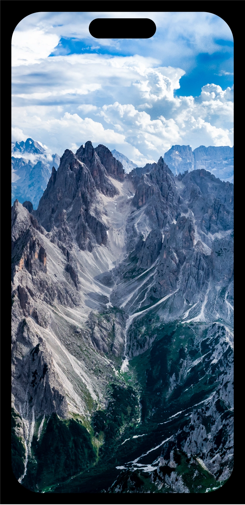
Most of the production team worked purely in Photoshop. I came in with a coding and web design background, and that ended up mattering more than I expected. A lot of decisions came down to format: whether a product screen should be a flat PNG masked into the hardware shot, or built as an SVG, whether the hardware needed to mask the screen content or the other way around, depending on the curve of the glass or the bezel.
Bridging the Gap
Because I understood how these assets would actually behave in a browser, responsive breakpoints, retina scaling, how a mask renders in CSS versus a flat comp, I was often the one talking directly with Apple's design and engineering teams about which approach to take. I could translate a design intent into the right technical decision before production time was spent building the wrong asset, and catch problems that wouldn't normally surface until a page was already live.

Pixel by Pixel
At Apple's level of scrutiny, nothing shipped until it was right, down to the pixel. Shadows were often handed off as a separate layer from the hardware render itself, and it was rarely a perfect match straight out of the box. Getting it right meant working by hand: correcting odd pixel artifacts, recolouring a shadow's edge where it had picked up the wrong tone, and refining the falloff until it sat convincingly against the product beneath it.



Banding
Gradients brought their own problem. Compression could introduce visible banding in a shadow or background, a flaw invisible at a glance but obvious once a page went live at full resolution. Fixing it meant adjusting compression settings or introducing fine grain to break the banding apart, smoothing the transition without softening the image overall.
Anti-aliasing
Icons and type demanded the same scrutiny at a smaller scale. Every edge had to render cleanly, no fringing, no inconsistent anti-aliasing between one icon and the next. At Apple's standard, a letterform that looked slightly different from its neighbour wasn't a rounding error, it was a defect.


The outcome — Contributed to two major fall launches, with work seen by millions.